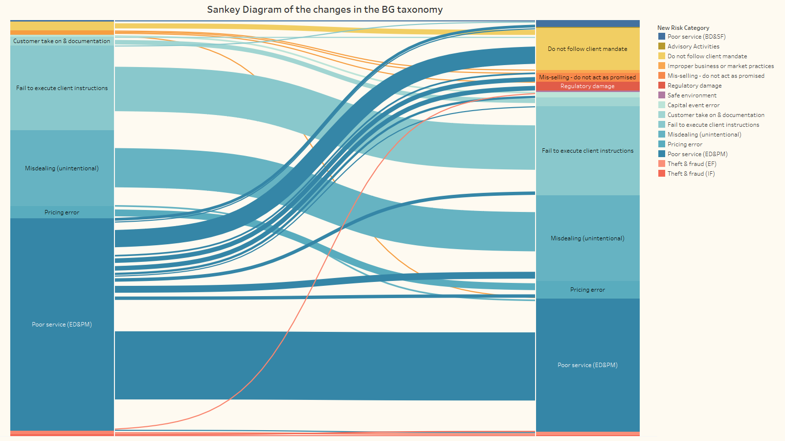
Sankey Diagram with Tableau
Currently working as a Data Analyst, I had some time playing with Tableau to create a nice visualization for a client.
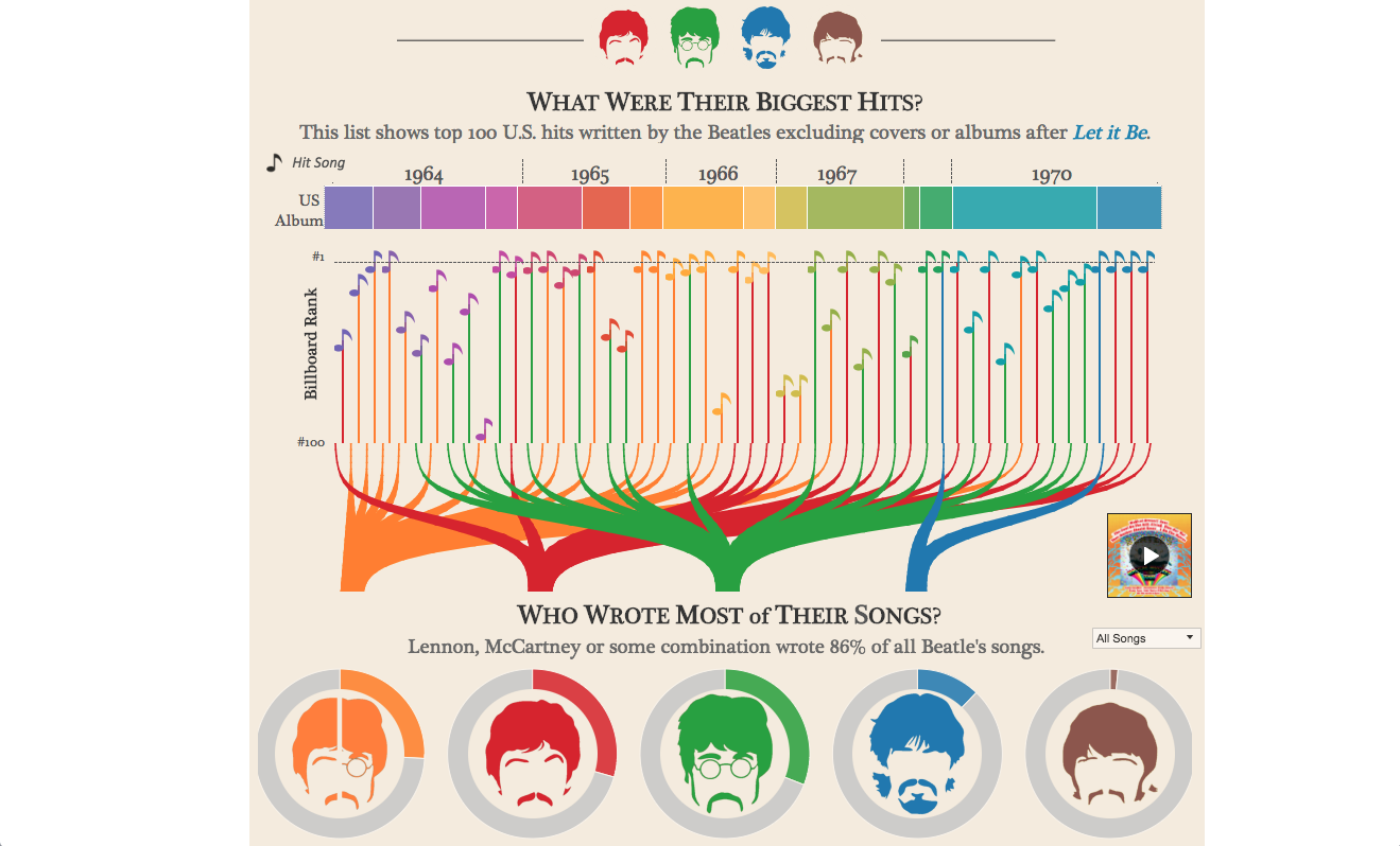
I always loved Sankey Diagrams, with one of my favourite being about The Beatles
My project was a bit less glamour. The goal was to find a nice way to show changes made by the client in a risk taxonomy. What impact it had on event allocation. A sankey Diagram is perfect at showing changes in allocation so I created the below diagram.